

H+W YARDCARE
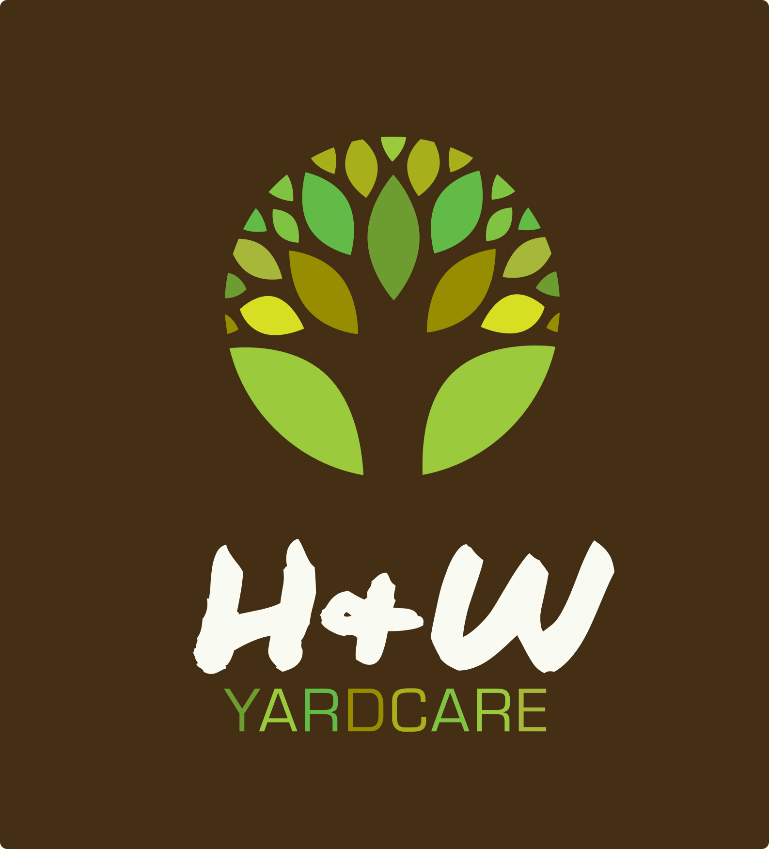
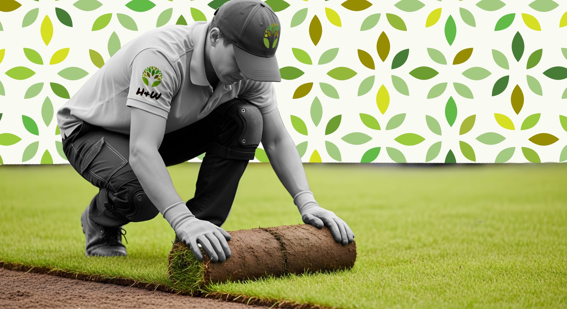
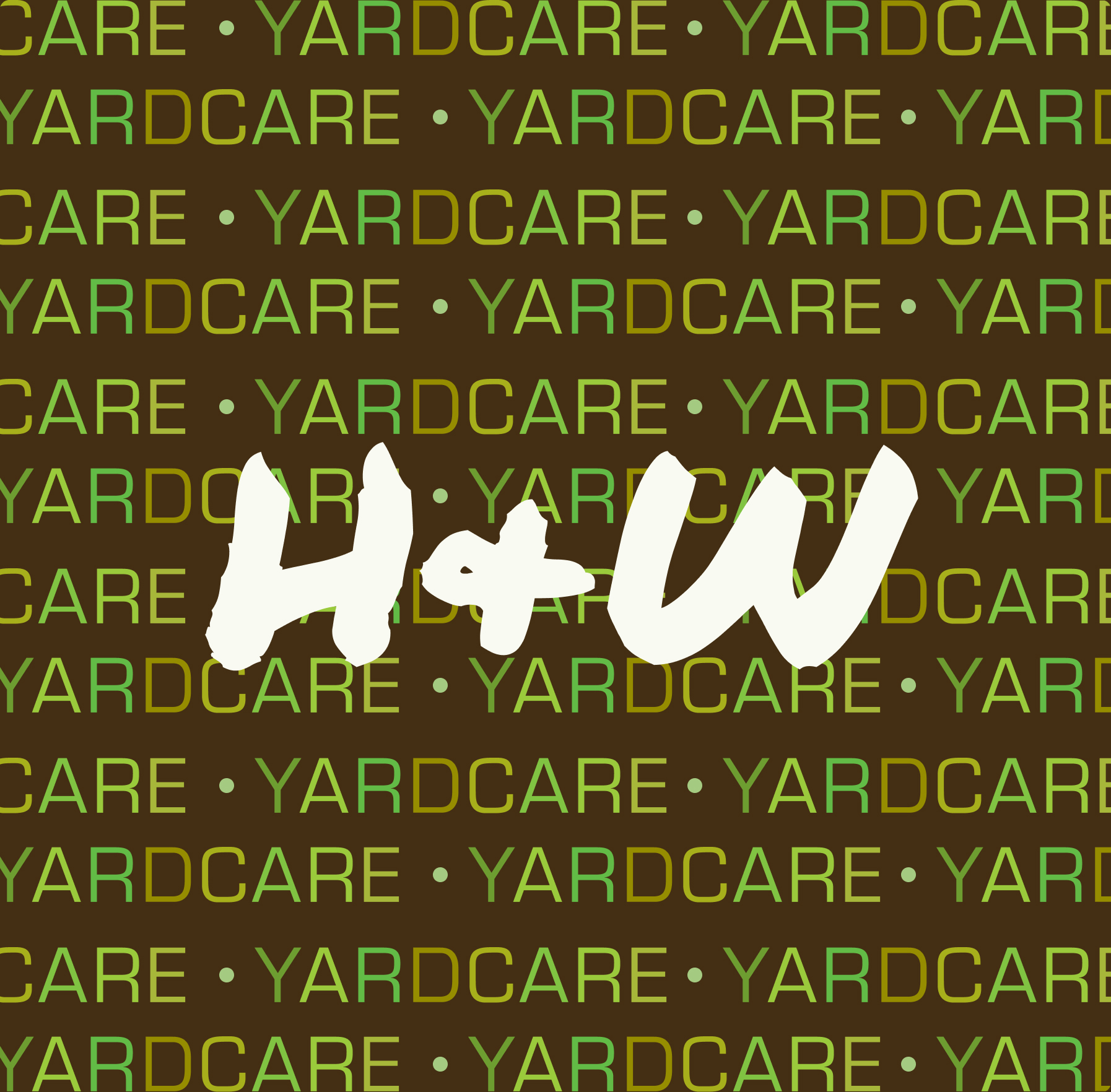
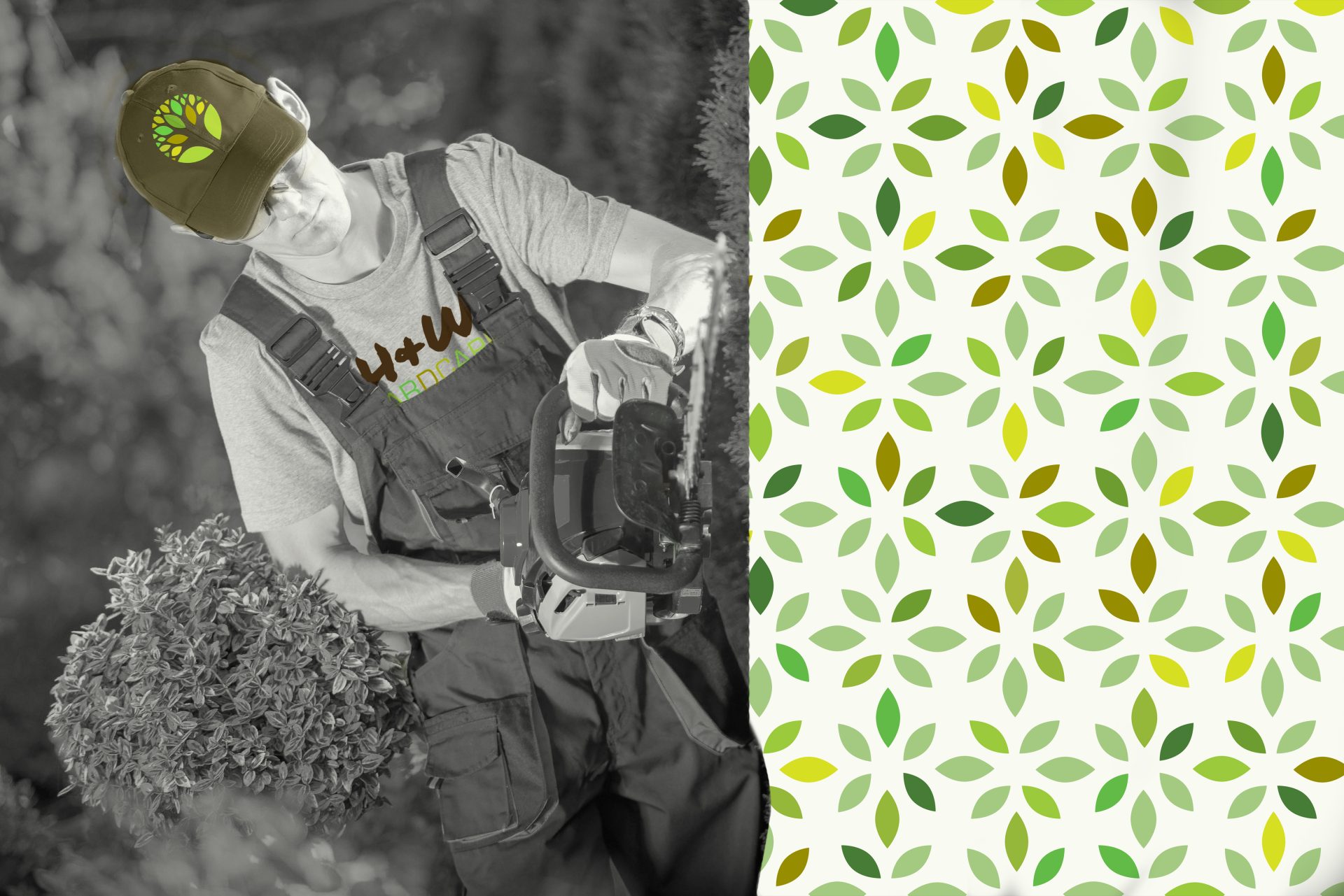
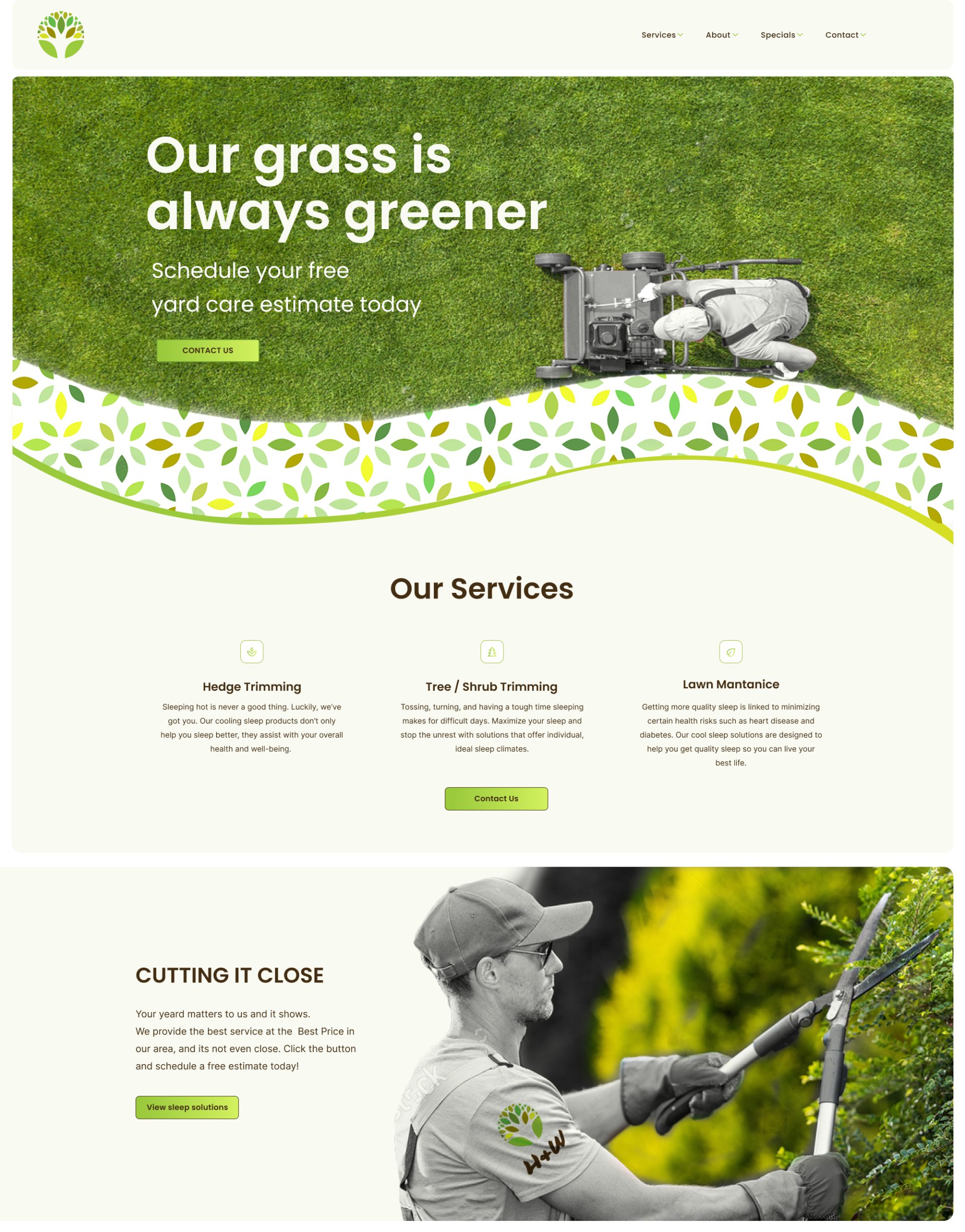
One of my first professional branding projects, and still one of my favorites. Brand new company based out if Portland Oregon needed to set there self apart from the thousands of other yard care companies in the area. The owner was adamant about using a hand written H+W that was done by his daughter in the branding, so we vectorized it and put some modern added a clean crisp logo mark using various green tones with a complementary soil brown. We gave them a unique photo treatment using a monotone matched with a colorful pattern that mimicked the logomark. Really proud of this one, and always will be.
Task
Building an internal tool of this scale is no small feat, but with the right approach, it can be a powerful force for uniting a company.




Next Project
Baum Architekten